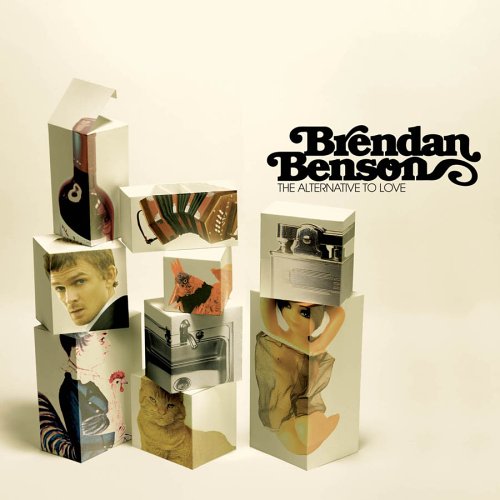
1. Brendan Benson - The Alternative To Love. Overall the artwork looked interesting, blocks of images on top of eachother suggesting musicality of the artist. The font used was quirky and made me think of those old Schoolhouse Rock cartoons. The music itself was rock/pop from the UK and I believe one of the tracks were used in an AT&T commercial.

2. Bittersweet - The Mating Game. Think James Bond crossed with Nikka Costa. Psychedelic artwork reflecting some laid back grooves of a solid duo. I really liked the album even though I'm not a fan of electronica. It really echoed the old school credits of the Sean Connery-era of Bond films. Oh, and they're featured on Grey's Anatomy and the Victoria's Secret Fashion Show.
3. Mattafix - Signs Of A Struggle. Simple photo of the duo in a disheveled living room. The photo popped among the others surrounding it and I grabbed it without even reading the album credits. It looked interesting and I wanted to know more. What I found was a great trip-hop album also from the UK.
Point of the story...I think I like album artwork coming out of the UK.


No comments:
Post a Comment